HQ colour be gone
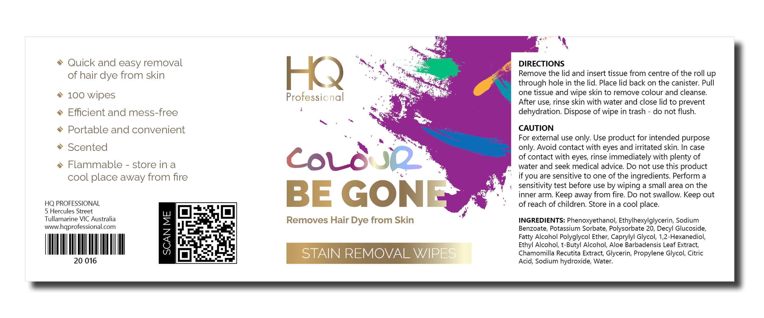
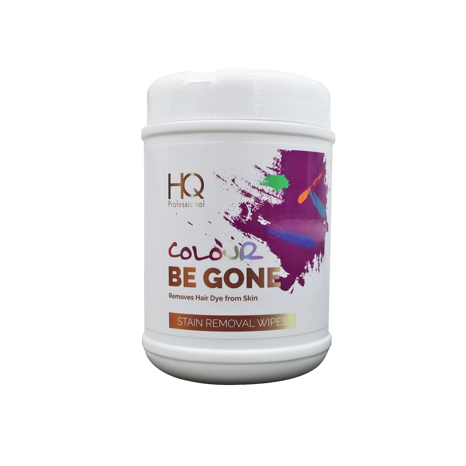
HQ Professional is a company dedicated to bringing a range of quality hair products to salon professionals and the general public. HQ Professional desired a colourful packaging design and marketing assets to promote their new product ‘HQ Colour Be Gone Stain Removal Wipes’. Starting out, there were so many ways to bring colour to the product design. I knew I wanted to utilise the consistent HQ Professional gold gradient for a luxe tone, and would use the HQ Professional typeface ‘Raleway’. Upon discussion of presented digital concepts, the client had an inspired vision - a colourful splatter. To market the end-product, I chose water droplets for moisture and bright pink and yellow to enhance the product design and make it ‘pop’.
logo refinement: combining rough hand-scripted font with raleway for a quirky element - to appeal to target market
GRADIENT BACKGROUND
COLOURFUL BUBBLES
RAINBOW OF COLOUR FADING
COLOURFUL SPLATTER
some of the concept ideaS presented to the client:
FINAL ARTWORK


